Components

Alert
Alerts call attention to a semantic message and load alongside the rest of the page content. They can optionally be dismissed upon user action.

Button
Buttons with labels represent the most important actions that users frequently trigger. They can vary in prominence and can include an icon.

Checkbox
A single Checkbox represents binary choices, such as accepting terms and conditions or activating and deactivating notifications.

Collection
Collection combines a list of items with controls for the view. The list can be a Table and the controls can be a Search, Filters, and Pagination.

ConfirmationModal
Confirmation Modals appear after users attempt to trigger an action with an effect that is irreversible or hard to reverse, such as deleting items.

ContextualHelp
Contextual Help is represented by a question mark trigger that is positioned next to an element and displays its definition when clicked.
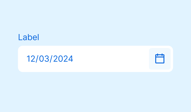
DatePicker
A Date Picker is a field for single date values that may include time. The date can be typed or selected with the help of a Calendar.

DateRangePicker
A Date Range Picker is a field for date period values that may include time. The date can be typed or selected in a Calendar.

EmptyState
An Empty State represents the state of a container, such as when there are no items to display or when the user isn't allowed to access items.

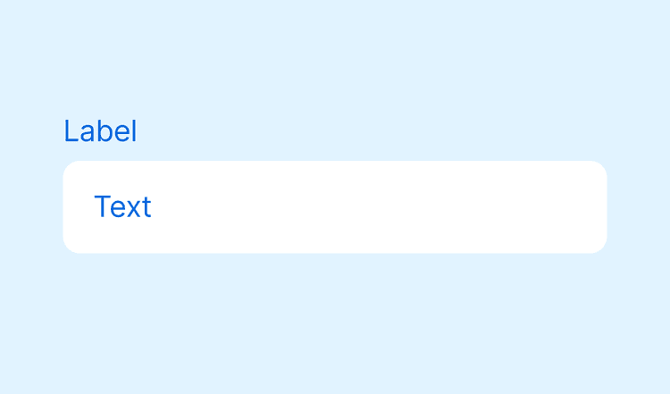
Field
Implementation of a fieldset

Filter
Filters represent criteria that users can choose to narrow down a Collection. They can include single or multiple selection.

Heading
Heading is used to define levels of typography
IconButton
Icon Buttons represent minor actions in a flow. It includes a label only for accessibility that is not visible, so the icon must be recognizable by itself.
Input
An Input is a field for short text values. It can include masks and character restrictions, such as accepting only numbers.

Label
Label component
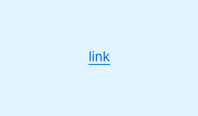
Link
Links represent navigation inside a page or between pages, including to pages outside the Admin. They exist within or directly after a text.

Menu
Menus summarize actions in a dropdown. They can include actions that are rarely used, complementary, or repeated for each item in a Collection.

Modal
Modal displays content related to a minor job within a page's main job. It demands complete attention and blocks interactions outside the overlay.

Page
The Page structure helps users to easily identify where they are, view content essential to the main job, and perform related actions.

Pagination
Pagination handles navigation inside a Collection. It displays the number of items, filtered or not, and allow users to navigate between pages.

Popover
Popover containers allow merchants to access and interact with more information of an item through an overlay.

Radio
Radio inputs allow users to select one option from a list. It should be used inside a RadioGroup component.

Search
Search is a text input that users can type to narrow down a Collection. Use Filters if values can be classified in predefined options.

Select
Select opens a dropdown with between five and seven values for users to choose one. Use Radios for less items or a Combobox for more items.

Skeleton
Skeletons compose a low-fidelity representation of content that will load. They appear when the entire page is loading and take up to 5s.

Spinner
Spinner informs that a specific element in the page is loading or a task is in progress. Use only for request that take over 1s and less than 5s.

Tab
Tabs are used to create up to five views inside a page. Use for related content that is not comparable, when a unified view is not necessary.

Table
Table lists items vertically and can include actions for each row. The columns display property values for users to scan, sort, and compare.

Tag
Tags differentiate items through a read-only text value in a colored bg. They can be secondary or primary, given their relevance to the main job.

Text
Text component

Textarea
Text Area is a field for text values that can take up more than one line in a form, such as descriptions or comments.
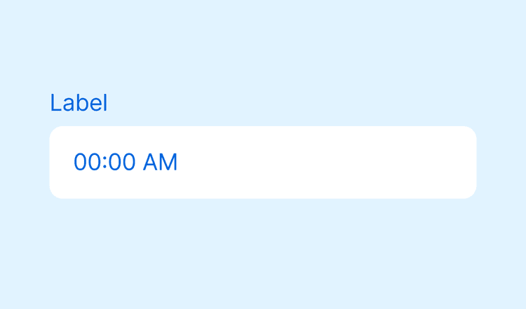
TimeInput
A Time Input is a field for a single time value.

ToastStack
Toasts can appear at any time to provide instant feedback on actions. They are usually temporary, but can also require the user to dismiss.

Tooltip
Tooltips display a label that was omitted when hovering the element. They shouldn't be essential for users to complete tasks.
Layouts

Bleed
Allows the content to bleed into the external container

Center
Centralizes its content

Content
Content containers allow merchants to easily scan information to understand its hierarchy and rhythm.

Flex
Flexbox layout

Grid
Grid layout

Stack
Spaces elements consistently
Primitives
AccessibleIcon
Makes icons accessible by adding a label. It can be used with Shoreline icons or other svg.

Clickable
Represents clickable surfaces

ComboboxInput
Renders a combobox input

Compose
Composes immediate child with its props and child own props. Used to implement Shoreline composition

LinkBox
A container that acts as a link. It allows text selection and stop its children event propagation.

LocaleProvider
Provides the locale

VisuallyHidden
Renders an element that is visually only to screen readers