DateRangePicker
A Date Range Picker is a field for date period values that may include time. The date can be typed or selected in a Calendar.
Optional props
className
Custom className
error
Wether has error
validate
A function that returns an error message if a given value is invalid.
Validation errors are displayed to the user when the form is submitted
if validationBehavior="native". For realtime validation, use the isInvalid
prop instead.
pageBehavior
Controls the behavior of paging. Pagination either works by advancing the visible page by visibleDuration (default) or one unit of visibleDuration.
minValue
The minimum allowed date that a user may select.
maxValue
The maximum allowed date that a user may select.
isDateUnavailable
Callback that is called for each date of the calendar. If it returns true, then the date is unavailable.
placeholderValue
A placeholder date that influences the format of the placeholder shown when no value is selected. Defaults to today's date at midnight.
hourCycle
Whether to display the time in 12 or 24 hour format. By default, this is determined by the user's locale.
granularity
Determines the smallest unit that is displayed in the date picker. By default, this is "day" for dates, and "minute" for times.
hideTimeZone
Whether to hide the time zone abbreviation.
shouldForceLeadingZeros
Whether to always show leading zeros in the month, day, and hour fields. By default, this is determined by the user's locale.
isDisabled
Whether the input is disabled.
isReadOnly
Whether the input can be selected but not changed by the user.
isRequired
Whether user input is required on the input before form submission.
isInvalid
Whether the input value is invalid.
validationBehavior
Whether to use native HTML form validation to prevent form submission when the value is missing or invalid, or mark the field as required or invalid via ARIA.
autoFocus
Whether the element should receive focus on render.
onFocus
Handler that is called when the element receives focus.
onBlur
Handler that is called when the element loses focus.
onFocusChange
Handler that is called when the element's focus status changes.
onKeyDown
Handler that is called when a key is pressed.
onKeyUp
Handler that is called when a key is released.
description
A description for the field. Provides a hint such as specific requirements for what to choose.
errorMessage
An error message for the field.
isOpen
Whether the overlay is open by default (controlled).
defaultOpen
Whether the overlay is open by default (uncontrolled).
onOpenChange
Handler that is called when the overlay's open state changes.
aria-label
Defines a string value that labels the current element.
aria-labelledby
Identifies the element (or elements) that labels the current element.
aria-describedby
Identifies the element (or elements) that describes the object.
aria-details
Identifies the element (or elements) that provide a detailed, extended description for the object.
allowsNonContiguousRanges
When combined with isDateUnavailable, determines whether non-contiguous ranges,
i.e. ranges containing unavailable dates, may be selected.
startName
The name of the start date input element, used when submitting an HTML form. See MDN.
endName
The name of the end date input element, used when submitting an HTML form. See MDN.
value
The current value (controlled).
defaultValue
The default value (uncontrolled).
onChange
Handler that is called when the value changes.
Related components
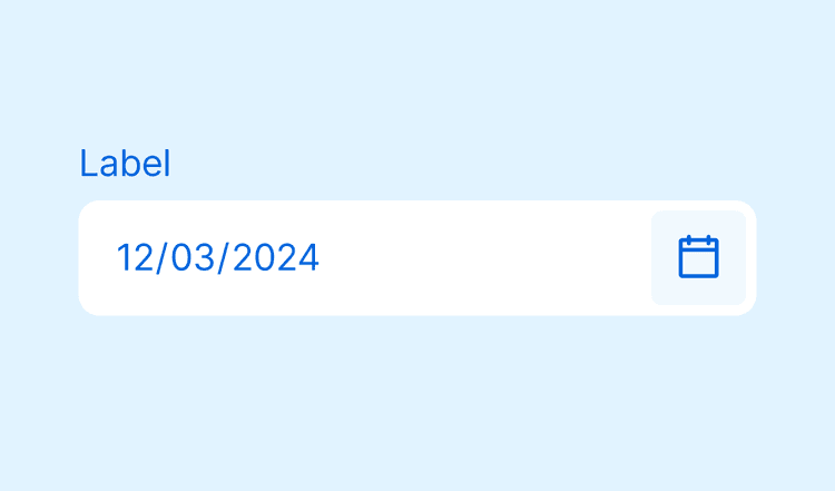
DatePicker
A Date Picker is a field for single date values that may include time. The date can be typed or selected with the help of a Calendar.
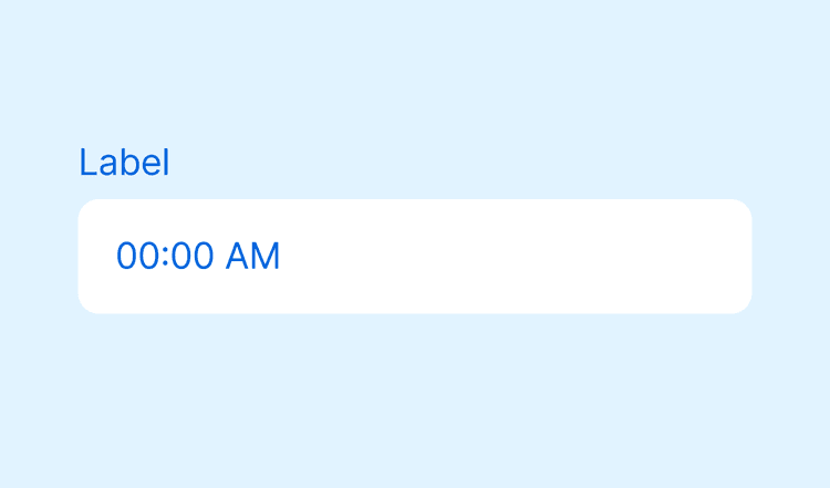
TimeInput
A Time Input is a field for a single time value.
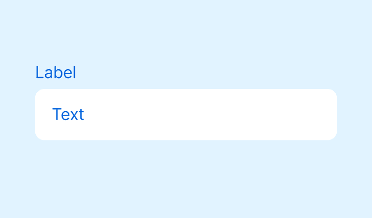
Input
An Input is a field for short text values. It can include masks and character restrictions, such as accepting only numbers.